Noul
Brand identity design
NOUL is a biotechnology company developing portable, AI-powered blood diagnostic devices, and our team was tasked with redefining its brand identity to clearly communicate its mission and technological vision.
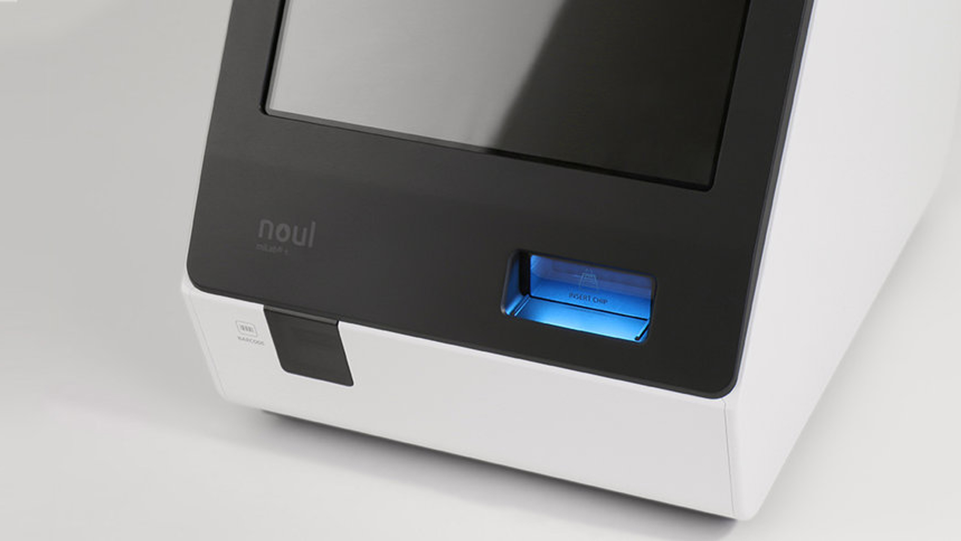
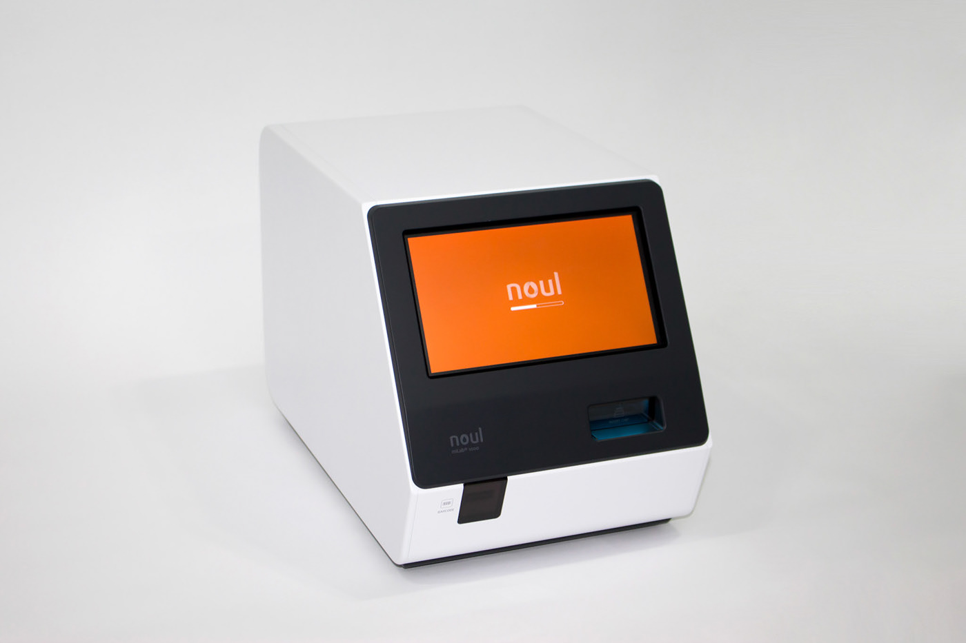
NOUL’s previous identity—featuring rounded typography and a blue-dominant palette—felt friendly but did not fully reflect the company’s mission in precise, life-saving diagnostic technology. To realign the brand with its core purpose, our team rebuilt the identity around the concept of “drop – life begins with a single drop.” The redesigned logo and symbol originate from the structural logic of a drop, representing the exact point where NOUL’s diagnostic process begins. This form symbolizes scientific precision, clarity, and the brand’s commitment to early detection that can ultimately save lives.
Design system ︎︎︎

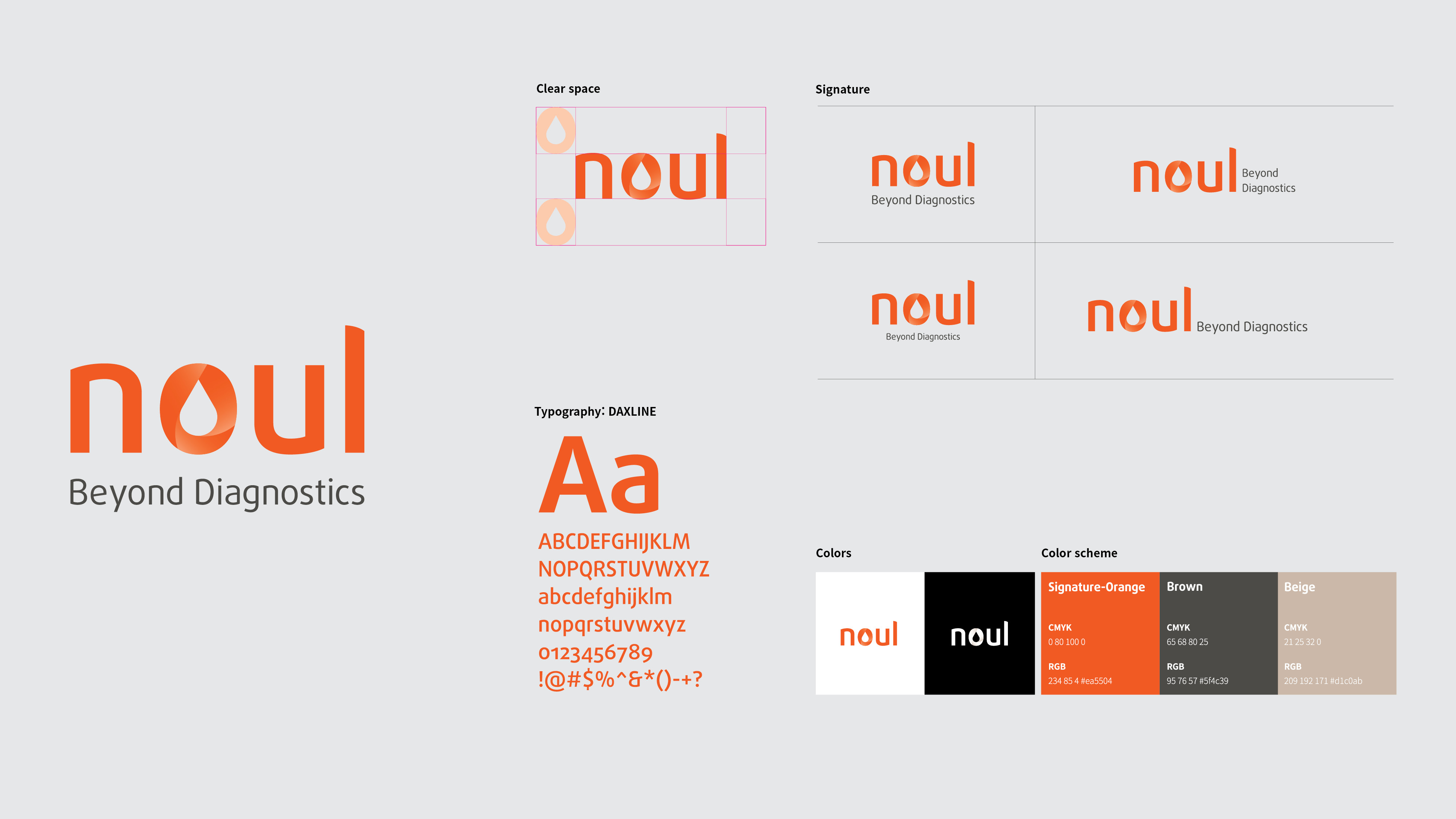
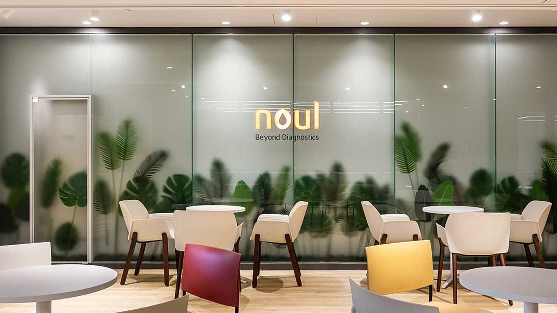
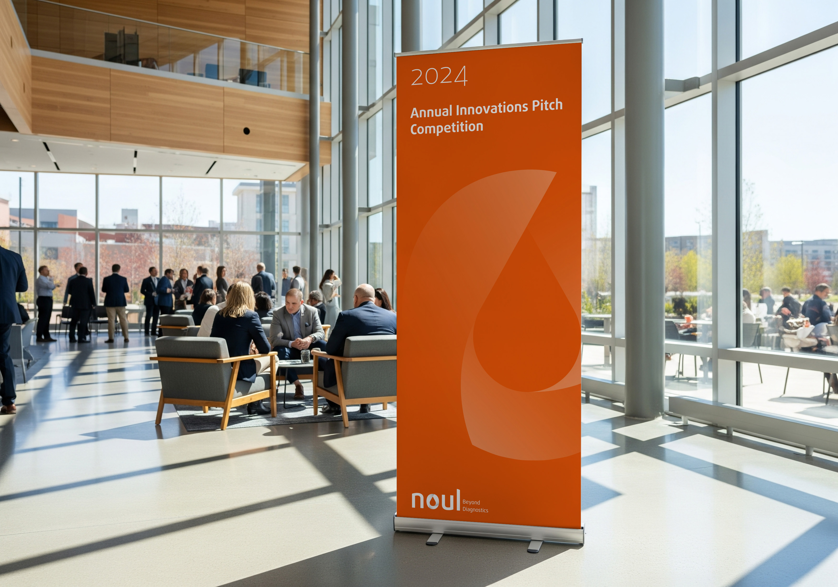
Supported by a refined typographic system and scalable visual architecture, the renewed identity communicates trust, accuracy, and global relevance. It enables NOUL to present a cohesive, credible brand presence across all digital and physical applications as it continues to expand worldwide.