Mimetics
Brand Identity Design
Redesigned the brand identity for Mimetics, a biotech start-up specializing in biomimetics (nature-inspired technology). Their core focus is developing innovative solutions by mimicking nature, with their most advanced technology inspired by octopus tentacles. Currently, their technology is being applied in skin patches, where it employs octopus suction cup technology boasting high absorption rates. Their vision is to expand beyond a skincare-focused business and see their biomimetic technology utilized across a wide range of industries.
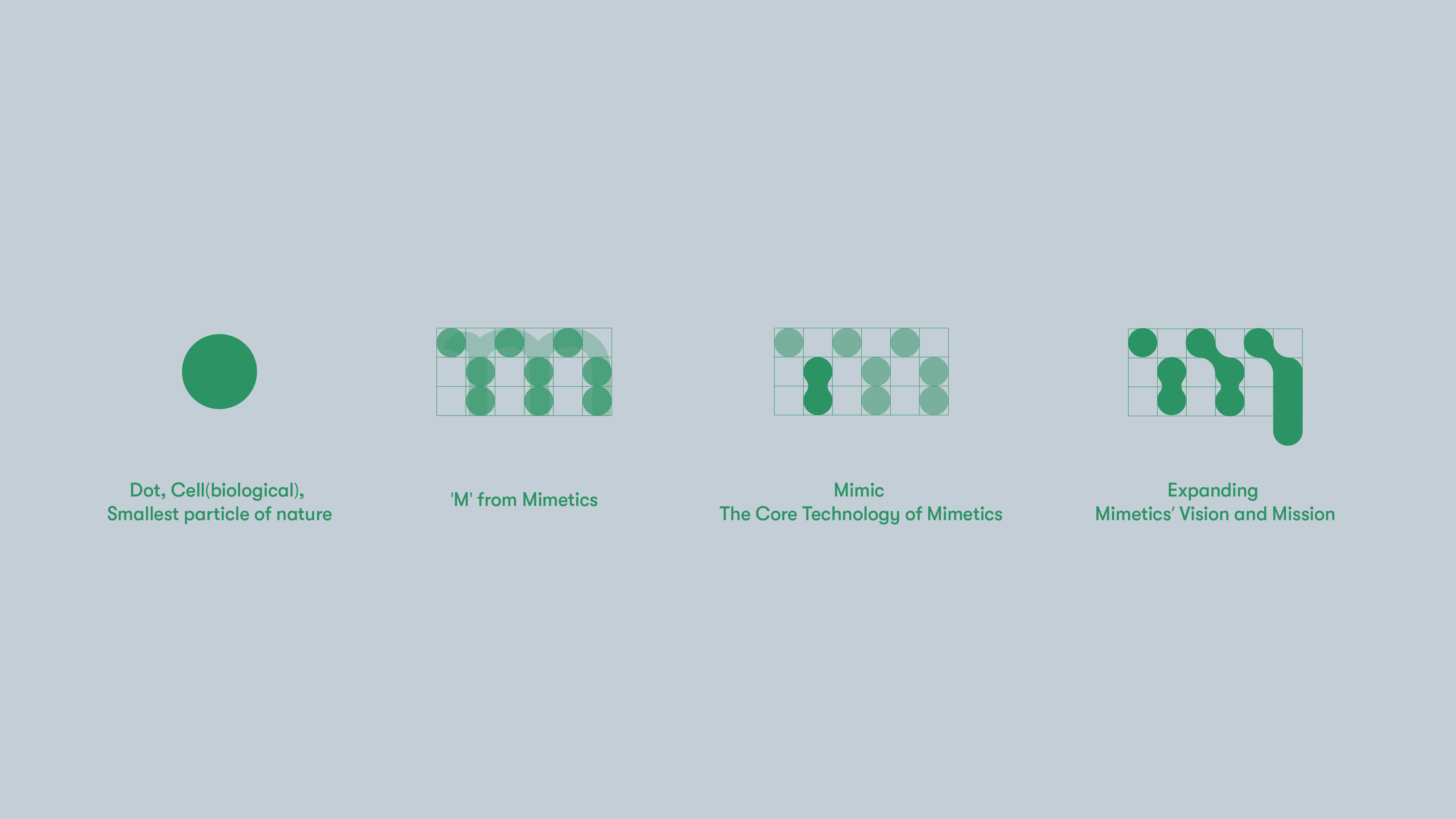
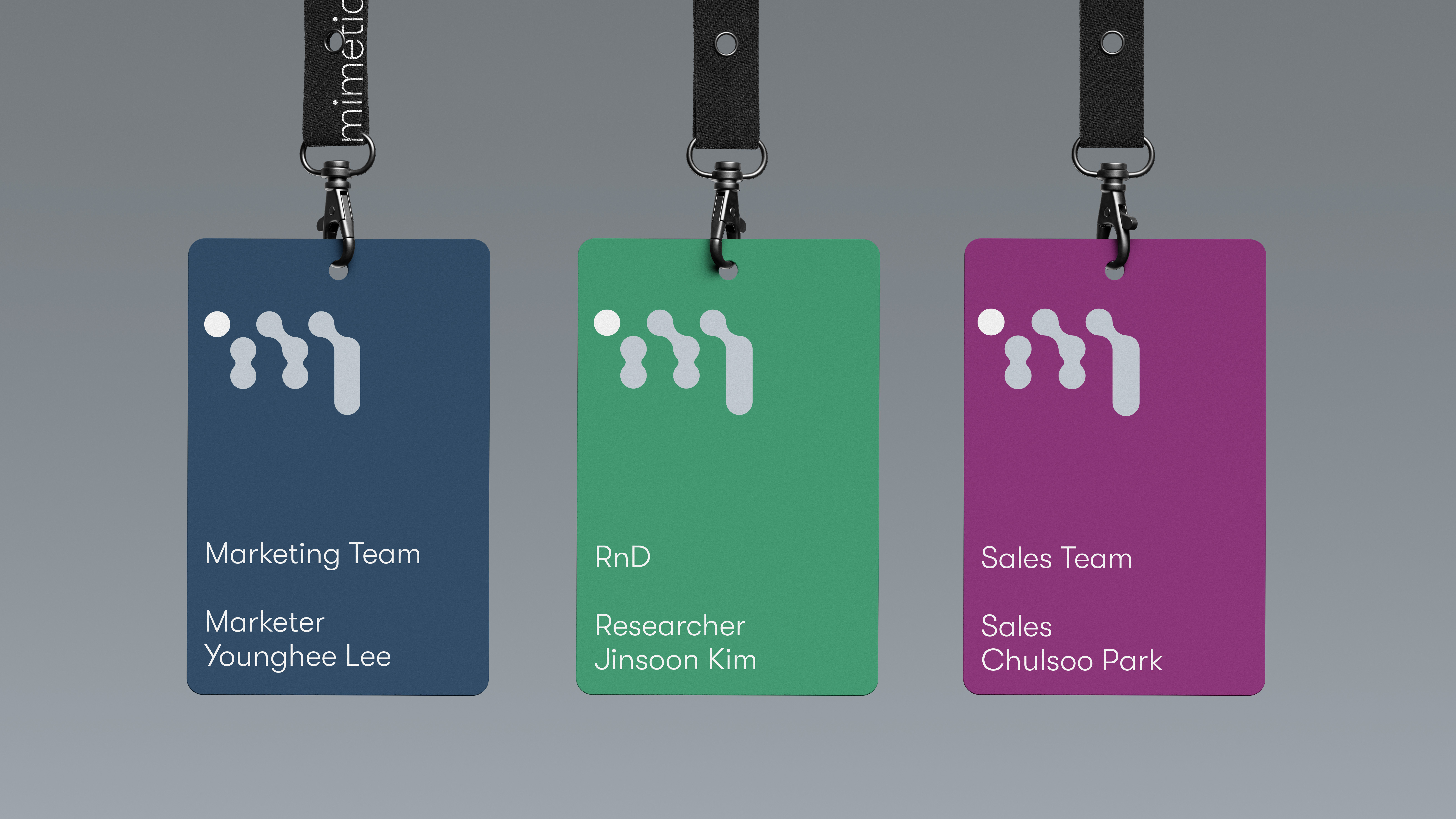
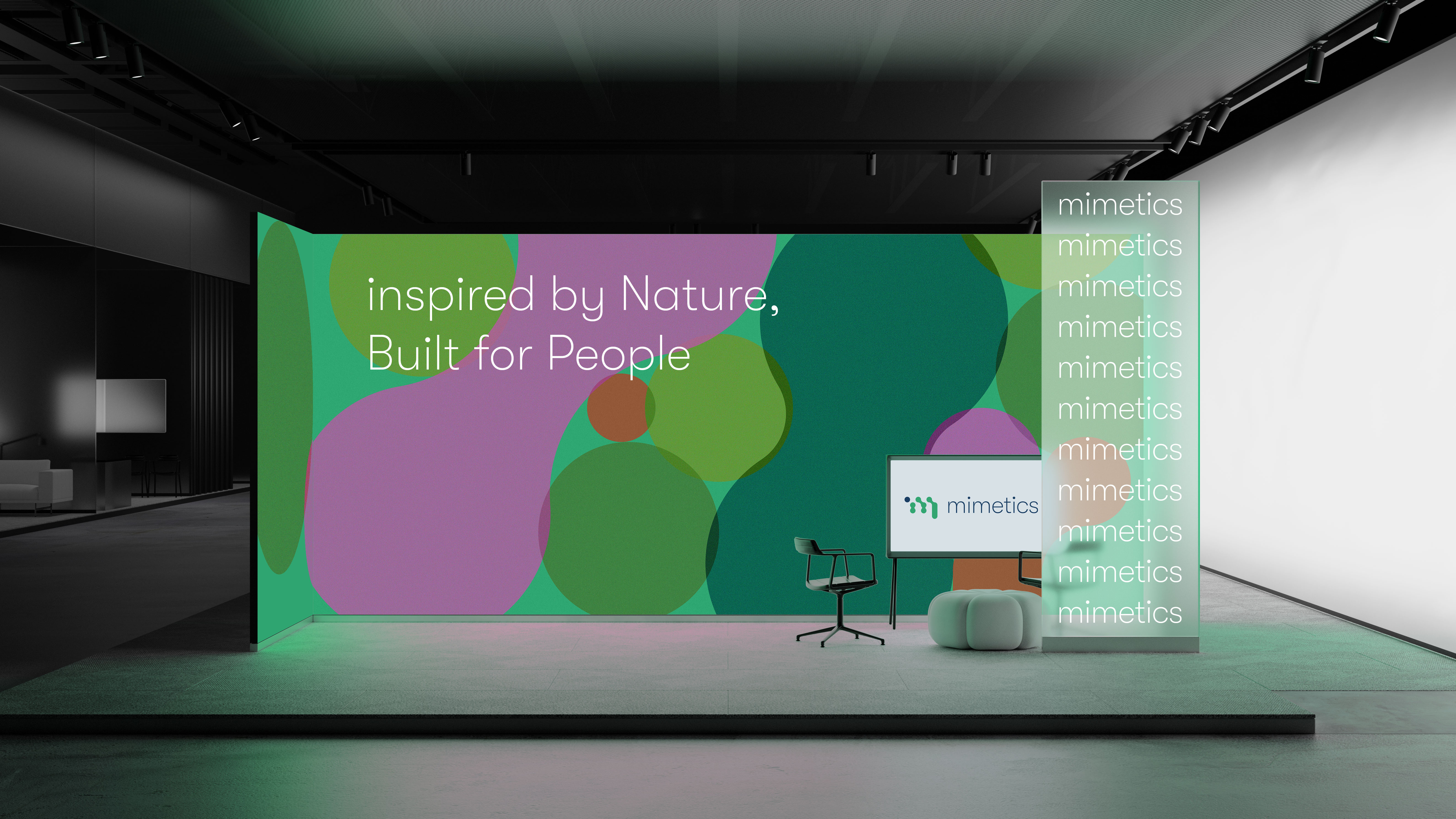
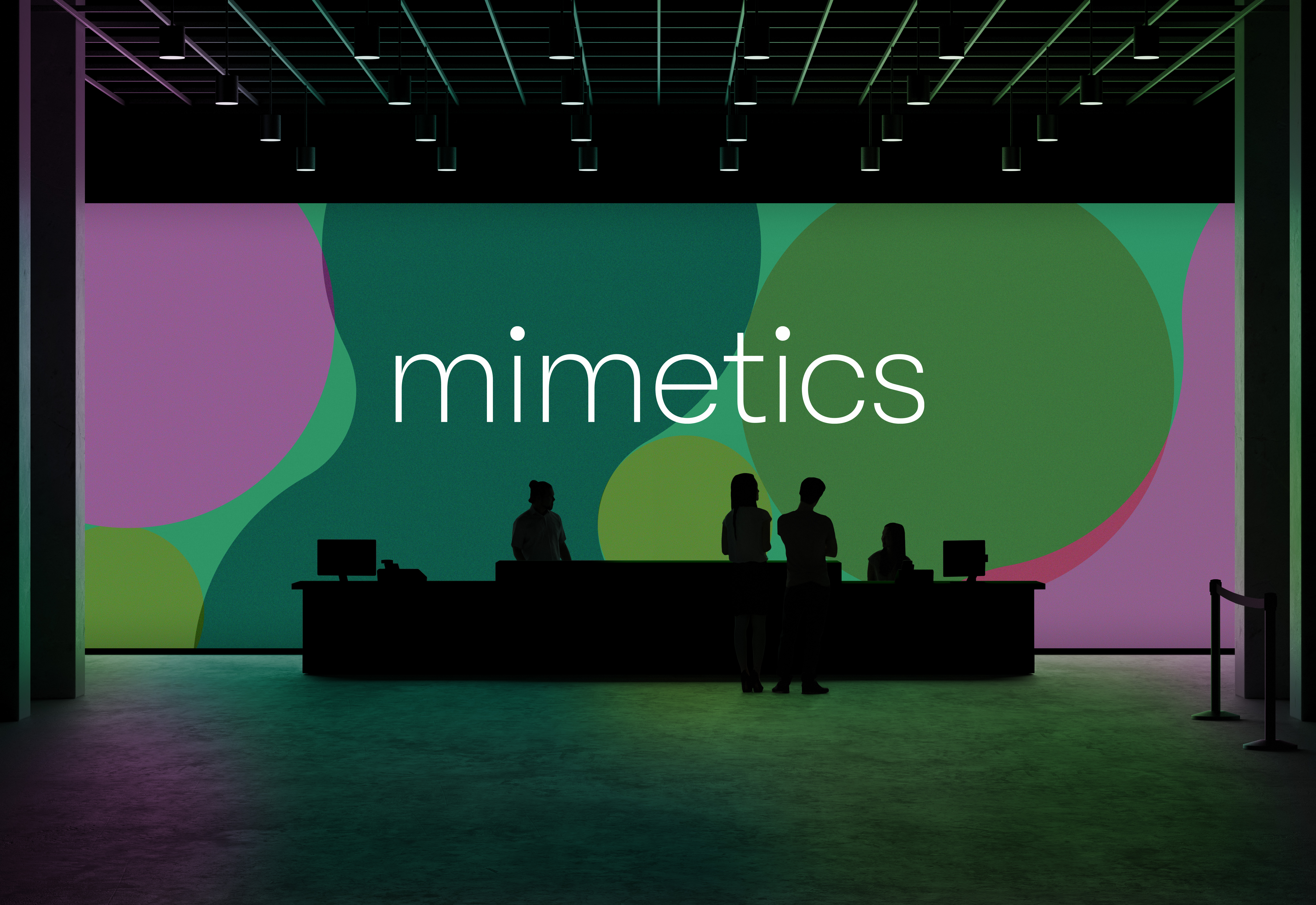
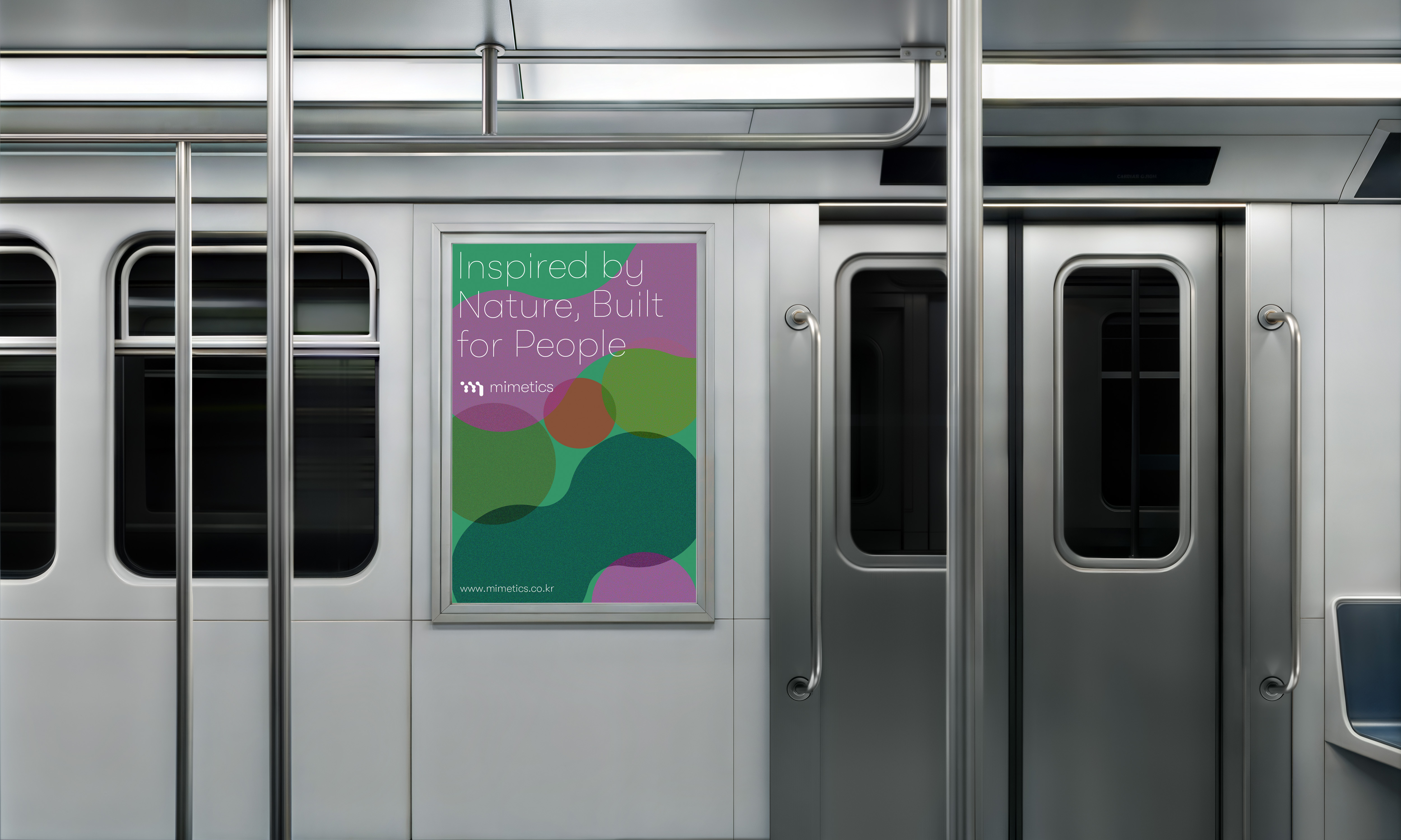
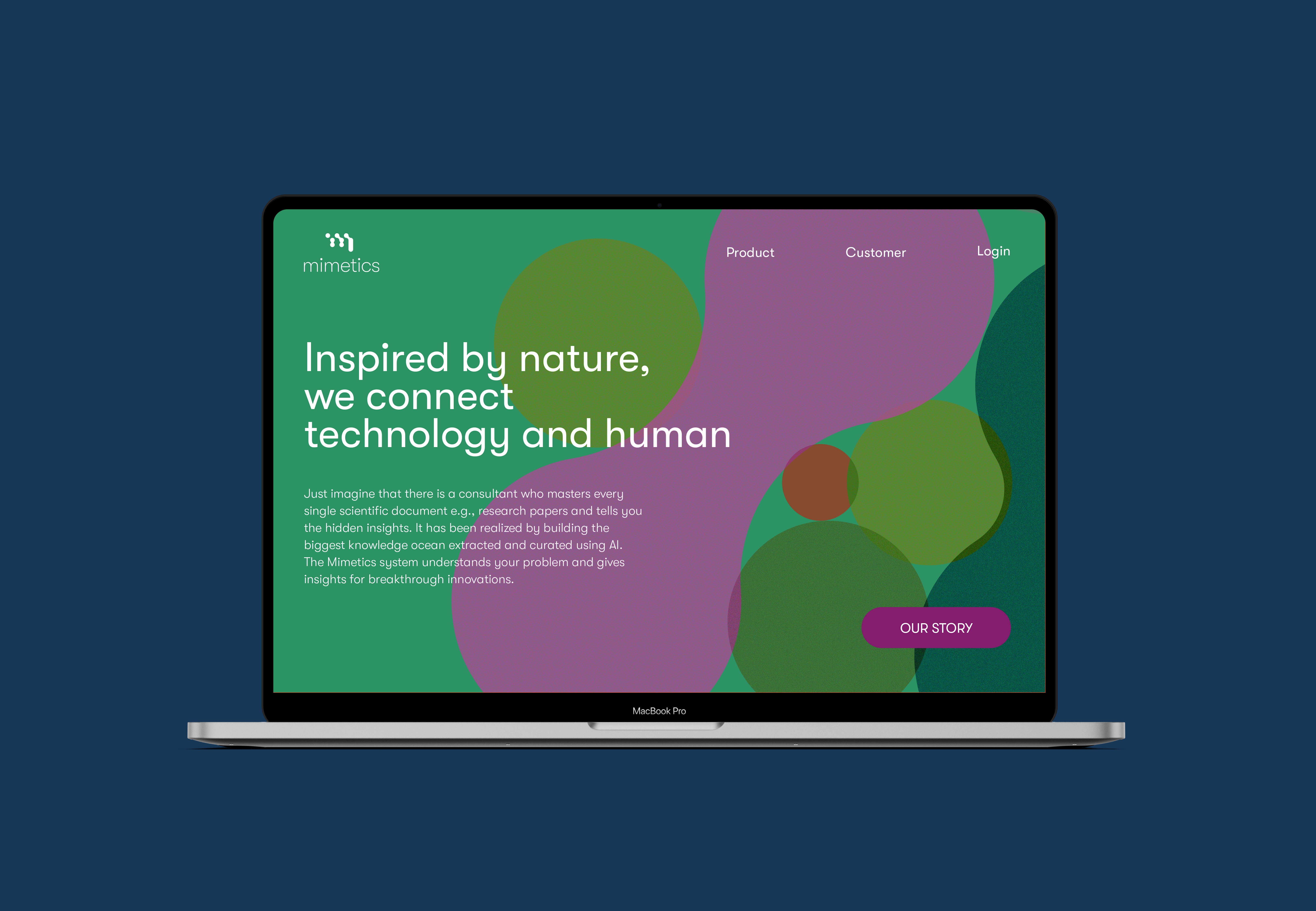
To reflect their vision, I created a brand identity rooted in the concepts of mimicry and expansion. Inspired by the circular geometry of octopus suction cups, the logo represents growth, adaptability, and the potential to scale their biomimetic technology across industries.
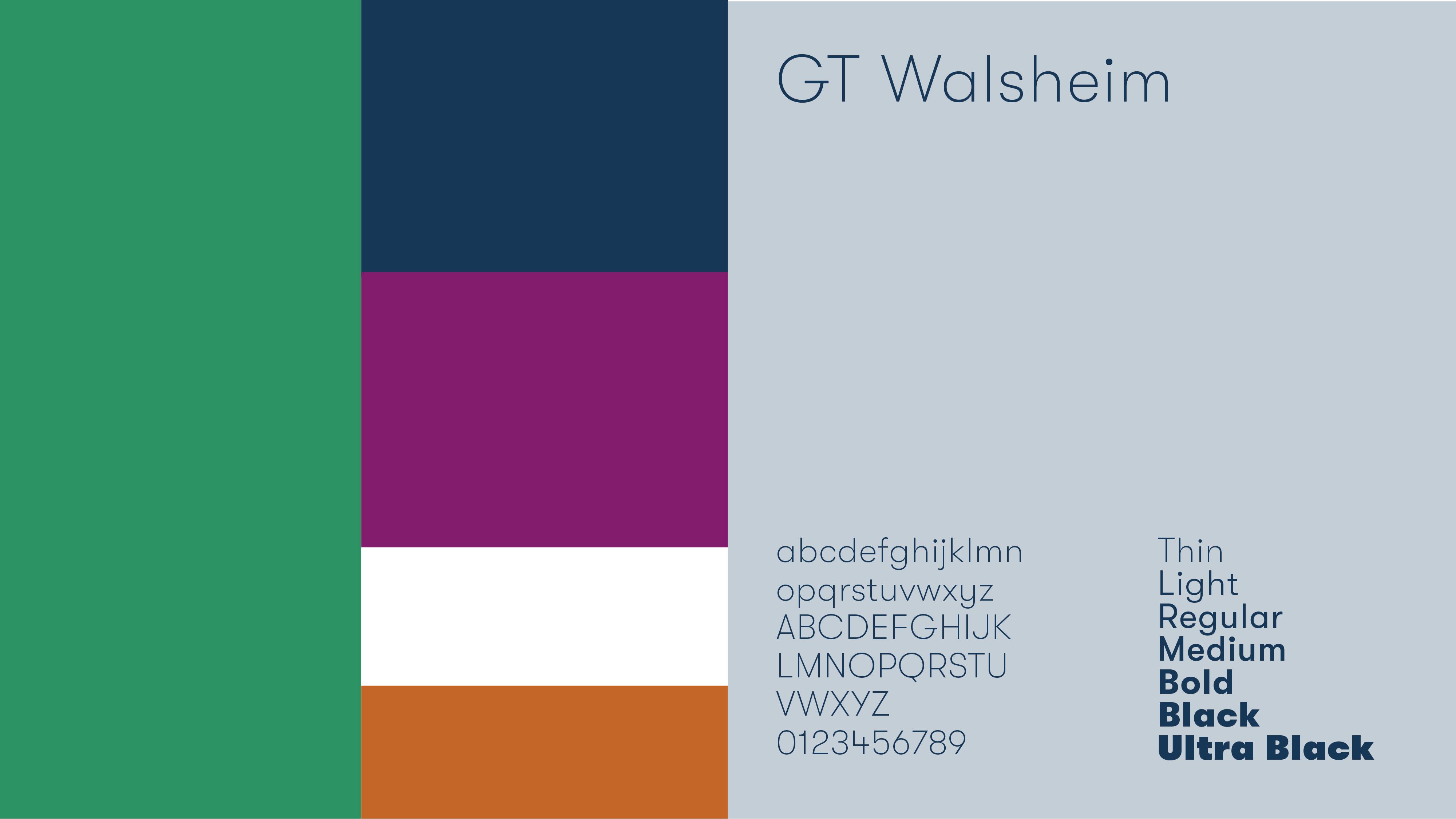
The colors are rooted in nature, yet their muted treatment reflects Mimetics’ identity as a science-focused, scalable biotech brand. Softer, desaturated tones create a sense of calm precision and prevent the palette from feeling too commercial or beauty-led.

Their technology is currently being applied to skincare products, with their flagship product being cosmetic sheet masks that enhance skin adhesion and absorption. To strengthen the brand and present Mimetics as a more approachable, design-forward biotech company, I developed a bold, graphic-driven packaging design based on thier new brand identity. The use of striking shapes and vibrant colors creates a fresh and modern look, moving away from the overly feminine or photo-based styles of traditional sheet masks. This approach makes the brand feel both innovative and consumer-friendly.
Designer Nayoung Kwon