Eternal Terms
Research
Typography Experiment
2016 Adobe Design Achievement Award, Typography, Semi-Finalist
Selected work for Hongik University's 70th Anniversary International Exchange Exhibition
Material: NT File (polyethylene-based transparent film paper)
Printing: Laser Print, Silk Screen
Selected work for Hongik University's 70th Anniversary International Exchange Exhibition
Material: NT File (polyethylene-based transparent film paper)
Printing: Laser Print, Silk Screen
Eternal Terms was inspired by the documentary Terms and Conditions May Apply (2013) by Cullen Hoback. His team raises awareness about how personal data can be exposed online, even when users believe they have deleted their accounts. Fascinated by this idea, I explored the concept of creating a ‘Terms and Conditions (book)’ that last forever.
To execute this concept, I utilized PE (plastic) paper, known for its durability, and employed silk screen printing. For the text, I selected the Terms and Conditions of ten of the most visited websites, such as Google and Facebook, carefully analyzing key passages that raised interesting questions about data privacy. I aimed to give these aspects the attention they deserve through typography experiments.
To execute this concept, I utilized PE (plastic) paper, known for its durability, and employed silk screen printing. For the text, I selected the Terms and Conditions of ten of the most visited websites, such as Google and Facebook, carefully analyzing key passages that raised interesting questions about data privacy. I aimed to give these aspects the attention they deserve through typography experiments.

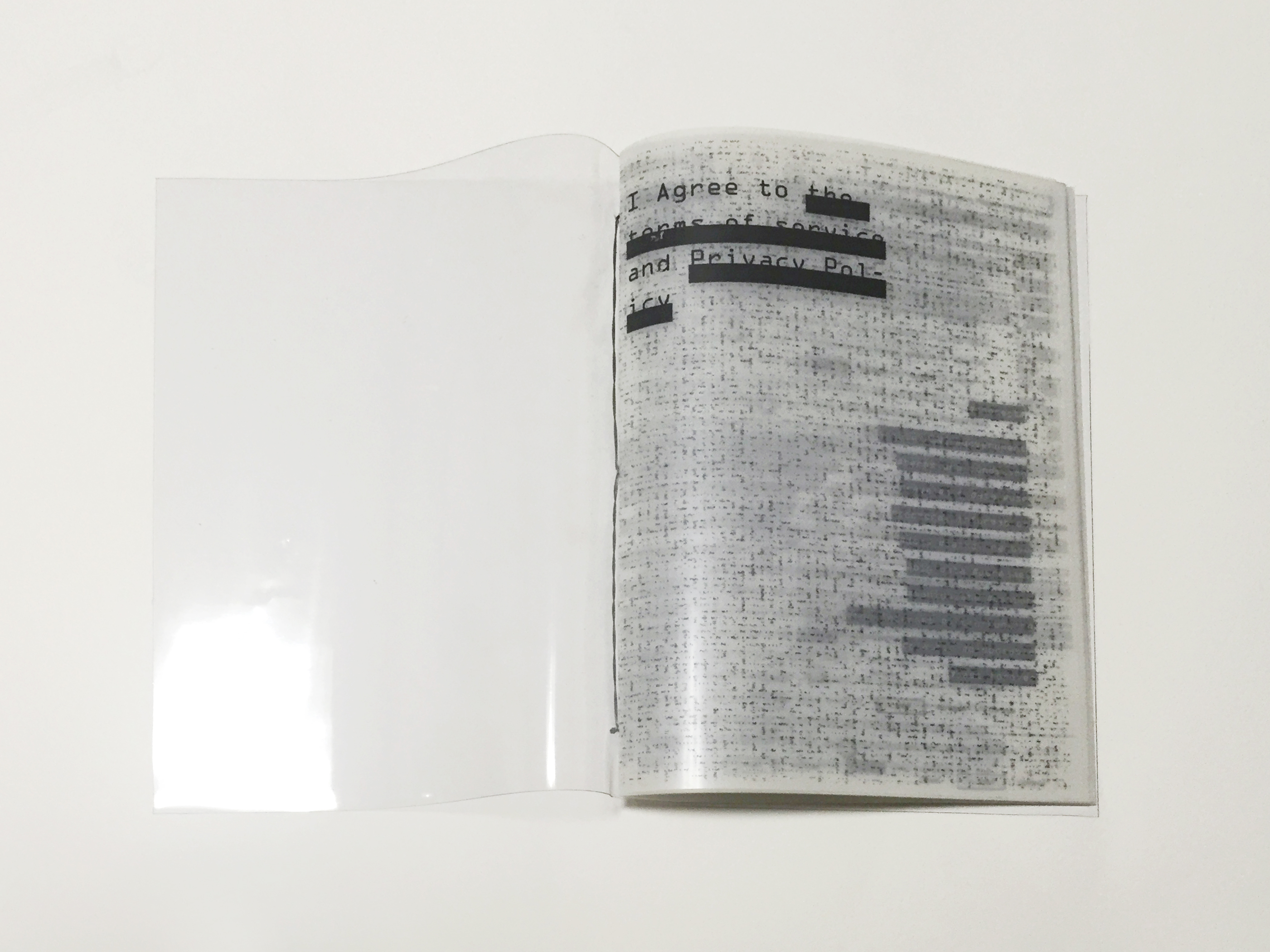


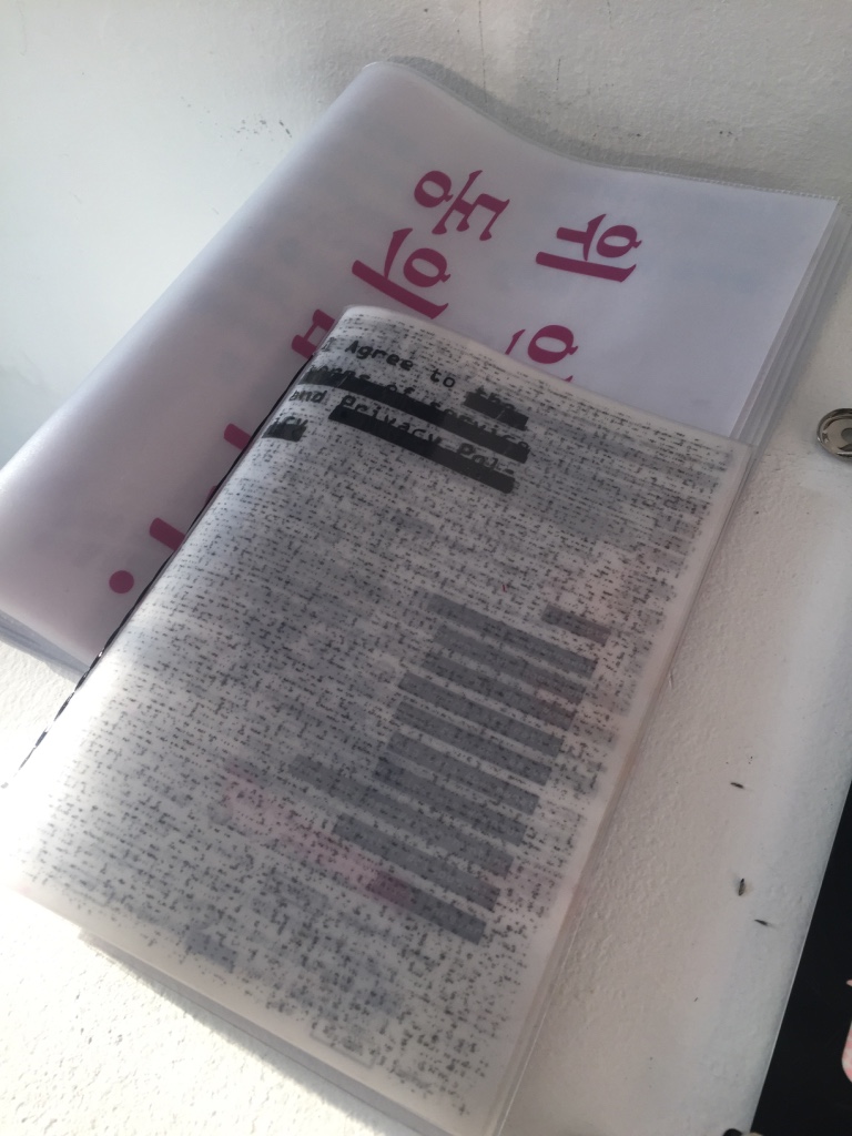
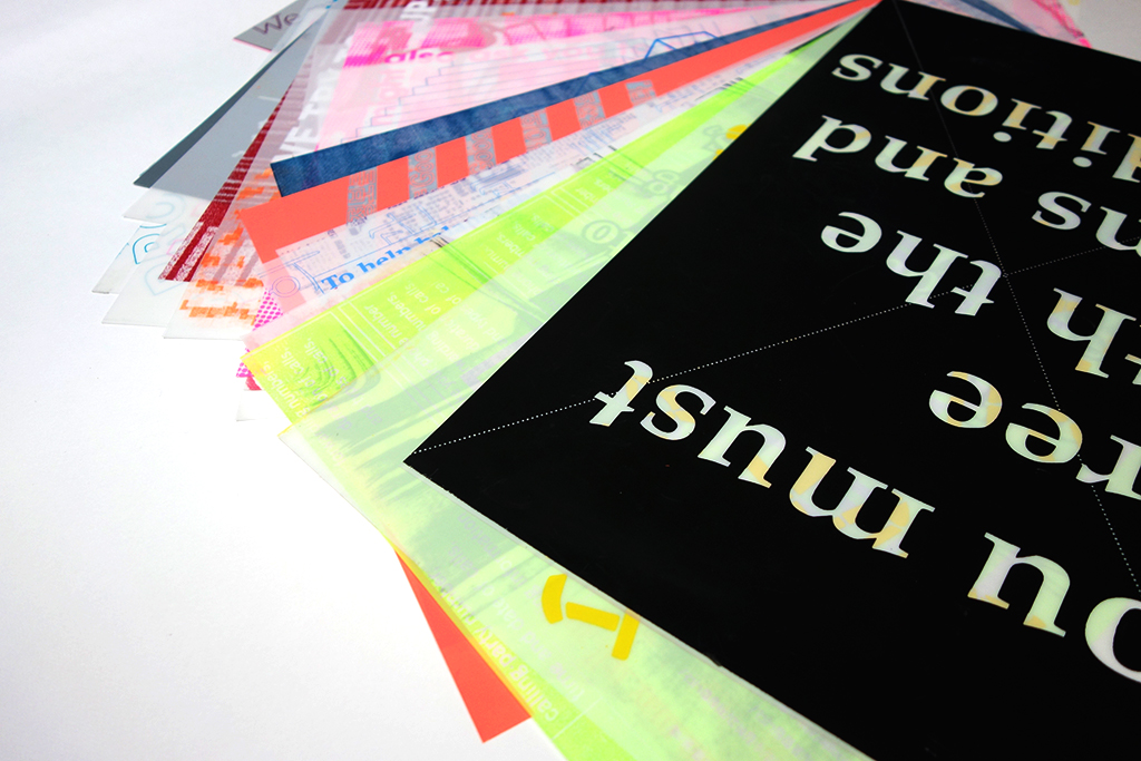
I created a series by making four different versions of the book for this project. For the first attempt, I created a book using Google’s Terms and Conditions for the texts and struck a line where there vague wording in it. The plastic material could melt in an offset printer so I used a small laser printer that I owned which was the book size. I used string made of plastic material for binding to the concept.


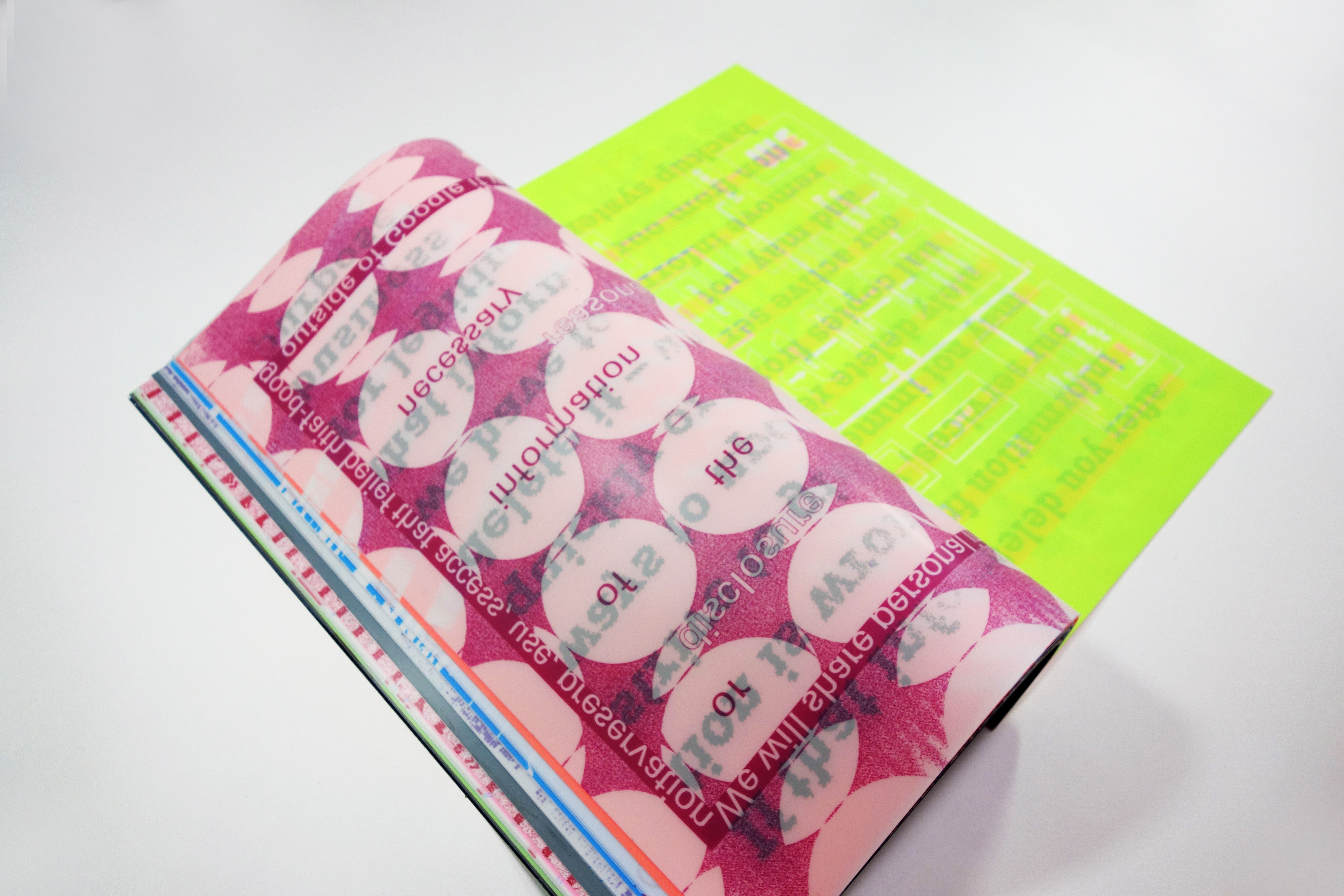
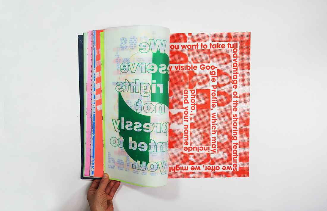
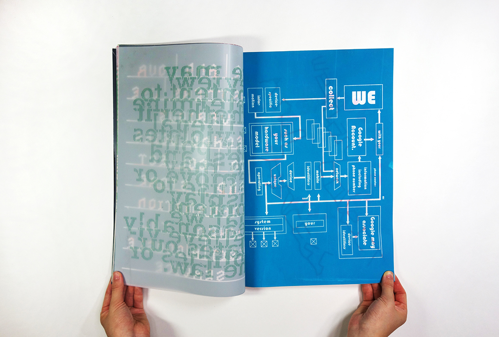
For the second attempt, I used the same text as the first book (Google’s Terms and Conditions), but here I varied the color, size, binding, and images because I wanted the book to be more dynamic. I thought having more diverse elements in the book could be a better way of conveying the concept since the intention was letting people know the Terms and Conditions in a new way.


The purpose of the third book was to have an additional reference for my project so that readers can have a better understanding of what motivated my project in the first place. I applied the documentary’s, ‘Terms and Conditions May Apply’, story for the contents and used vinyl textbook covers for the book finishin so as to keep the ‘digital eternity’ concept. For the paper, I used tracing paper and put it in a vinyl cover.

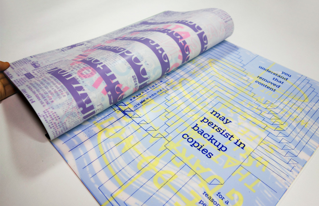


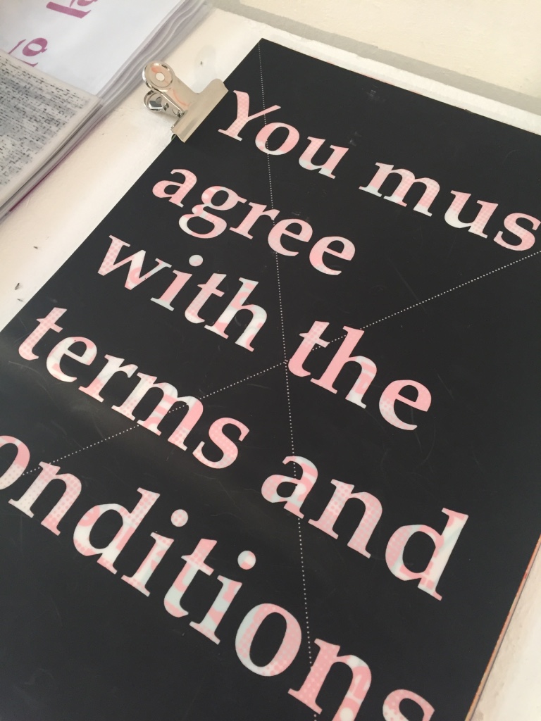
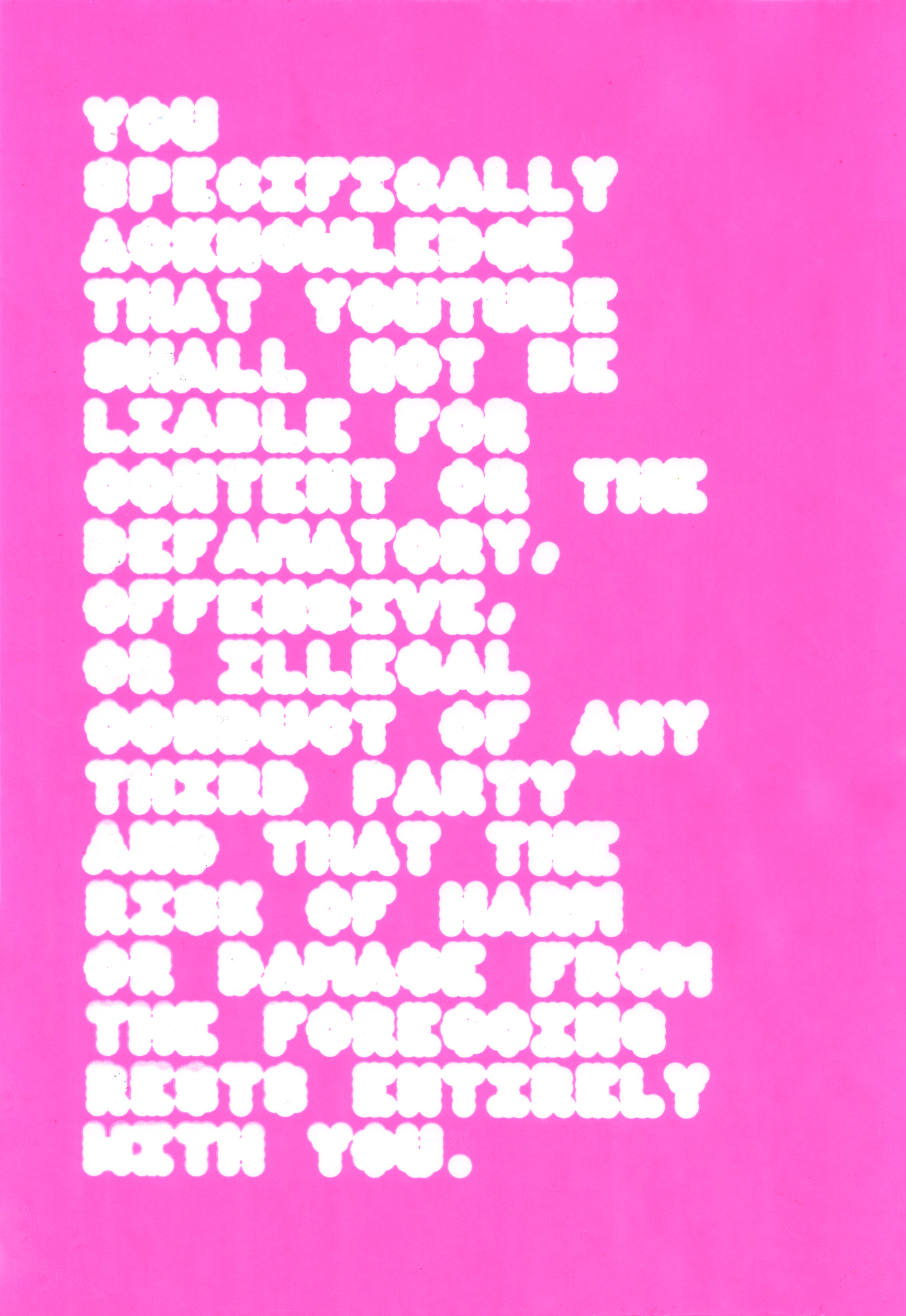
For the final version, I opted for ten of the most traffic-heav sites on the web, such as Google and Facebook, to study their Terms and Conditions. I carefully read each page and highlighted any specific line that had ambiguous or might look questionable content. I decided to give this content the attention it deserved by displaying it in an expressive way via a bright, visual medium, as opposed to a small black-and-white print. Since the paper size was too big for a laser printer, I used silkscreen, which gave more interesting results in terms of texture and color.


Exhibition